Monday, 25 February 2013

Evaluation

 In what ways does your media product use, develop or challenge forms and conventions of real media products?
My school magazine uses many different types of media products, as I had to carry out a lot of research before I began designing my final piece. I had to research many different types of school magazines to be able to identify what and how the main codes and conventions used on the different layouts. By carrying out this research it enabled me to get different ideas of how to design my final piece and what to include on the front cover and contents page.
How does your media product represent particular social groups?
As my task was to create a school magazine, my media product only really represents the social groups that attend or are involved in the education society. My magazine represents the school well as it includes a lot of information and images that happen around the sports department of the school so therefore would attract social groups from other local schools that are interesting in finding out what happens elsewhere in the borough.
What kind of media institution might distribute your media product and why?
The type of media institution that is more likely to distribute my media product would be the school itself, Trinity School Church Of England. This would be the perfect media institution to distribute my media magazine as it would help to promote the different sports in the school.
Who would be the audience for your media product?
The audience for my magazine would be school children aged 11-19, as it is a school magazine, also parents of the children that attend the school may wish to have a look at my magazine too which it would also be suitable for them. The main purpose of my magazine is to let pupils know about the success around the school in the PE and Sports area, therefore my magazine is more for the sporty children and for the pupils that enjoy playing sports within the school.
How did you attract/address your audience?
I used many different ways to address my audience; I used a bight background which was a light blue and a bold darker blue main heading. I chose to use these colours as they are the colour of Trinity School, which would have meant the magazine was more suited for the school. I have used a lot of different photos of a range of sports that had been played throughout the last few weeks while I had been creating my final product as it would mean that the information that I had included would have more meanings for the pupils that read the magazine. Also by using a range of different images rather than lots of text would help keep the reader’s attention for longer period of time. I used a banner on my front page as I made this issue a special Christmas edition. I included this as it would also help attract the audience’s attention more as the majority of children look forward to Christmas. Overall I made sure that my magazine included a range of bright colours with boarders around my images which helped make them stand out, and used a lot of bright eye-catching colours.
What have you learnt about technologies from the process of constructing this product?
Throughout completeing the Prelim task I have learnt many different skills in many different programmes. I created my magazine in Adobe InDesign CS6, which I had never used before. I learnt how important it is to create and stick to the different layers as it helped me to edit it as I went through. I also used photoshop quite a lot to edit some of my photos and to delete some of the white backgrounds from behind my images, this was important to learn to give the magazine a more professional finish towards the end.
By completing this prelim task I have learnt many different skills that I will need in future for when I start my main task. The research I undertook gave me an understanding of many different things that I needed to include to be able to get a higer mark and helped expand my knowledge in media as I had never learnt any media words before as I am new to the subject. I am therefore going to include the knowledge I have learnt in this prelim task in my final task I am due to compete in the upcoming months.

Final Peices

These are my final prints of my School Magazine. I have made a few changes on both my front cover and contents page.


Thursday, 7 February 2013

Progression

This is my initial draft that I had planned for my contents page.


This is my draft after I had made my first changes. As you can see the layout of the images are completely diffetent as they didnt really work the way they were layed out before. I also added a boarder around the outside of the images as this helps make the outlines distinctive.


This is my first draft for my front page. As you can see I haven't uploaded my main photo yet but the rest of the furniture is in place. 

Here you can see that I have now uploaded my main photo and there are slight changes to the cover lines. Also I have changed the image of the bullet points as they are more eye catching than the black ones.


Tuesday, 29 January 2013

Photography used


I have chosen to use this image on my contents page as I feel it helps explain how the teachers join in with some of the activities they students do. This image is also of good quality and is more focused on the teacher.

I have chosen to use this images out of the images I had taken on the trampolines as it helps show the best of ability that is taught during the trampolining club.
 

I have chosen this image out of the many photos I have taken as it was the best shot as the ball and player  is mid in the air while performing a lay up. This is a very popular shot while playing basketball. I also chose this image as it was the least blurred as this photo was taken in sports mode on the camera.
I have chosen to use this photo out of the other team photos I have taken as this photo all the team were looking into the camera and are facing forward. A few of the other shots one player was slightly standing sideways and I thought face on team photos would be much better.


I have chosen to add this photo onto my contents page as it helps show the variety of sports that the school offers to pupils during their PE lessons. This shot is good as it is an action shot of an underarm defensive shot which shows the variety of shots that are taught during the lesson.

I have chosen to add this photo to include on my contents page as I think it is a good action shot of a pupil playing table tennis during their PE lesson.
I used this image on the contents page as it is a good image that shows the main positions in trampolining. During trampolining club they use this move as a warm up jump.

All Photography

Here are all the different shots I took to go on my School Magazine. I then went through and chose the photos that would best fit on the page and suited very well. I also looked at the image quiality as this is important as the magazine wouldnt look very good if there was blurry images added.


Monday, 21 January 2013

Audience

Overall I have chosen to follow my front cover draft number 1, and contents page draft number 3. I have chosen these drafts as they are suitable for my target audience, children aged 12-19 and who are interested in Sport and PE. I have chosen this particular audience as I feel that there will be a of interest in this partular area, also I feel that it would be the best for me as I will be able to relate to some of the imformation I am going to include. I have chosen to do my magazine purley about sports, I feel that this will bring out the bet of my abiltiy as I am a keen sports player.
I have chosen a blue, white and red colour scheme as Trinity School already has blue colour scheme and also the bright colours that I am going to use which will also catch the readers eye, also giving a possibility that the bright colours may catch other peoples eyes that may not particulary interested in sports.


Contents Page Draft #3


I like the way that the main heading is bold and centered at the top of the page. I also like the way the images are aligned on the right but linked with arrows to the correct explanation in the contents. I like the way there are alternate colours down the contents as this is eye catching.

Sunday, 20 January 2013

Contents Page Draft #2


This is another contents page draft. Here I have drawn the main header in bold and centered. I have included  photos down the left hand side of the page which will help give more of an idea of what is going to be inside the magazine.

Contents Page Draft #1


This is a double page contents page. I like the way there are photos scattered around the majority of the pages with a 'next week' box to give an insite on what is going to be in next weeks issue I also like the way there is a main heading on the page that is centered to the left page and is bold. This helps make it stand out from the rest of the page.


Front Cover Draft #2


This is another one of my drafts . I have chosen to have a main photo with some cover lines as this helps to stand out more but also give readers a bit of information about what is going to be inside.  I have also included some useful codes and conventions to help give the audience information about the issue number and dates. My main heading is capitalized and bold. Overall I think this is a good draft but I that my first draft is better to use as my final piece.

Wednesday, 16 January 2013

Front Cover Draft #1


This is my first front cover draft. I have chosen this layout as it is easy to understand. I have used a 'this week' box to give an in site of what is going to be inside the magazine. I have also included some useful codes and conventions to help give the audience information about the issue number and dates. My main heading is capitalized and bold. Overall I think this is a good draft I am able to used for my final Front cover page.

Wednesday, 5 December 2012

Magazine Contents Page Examples

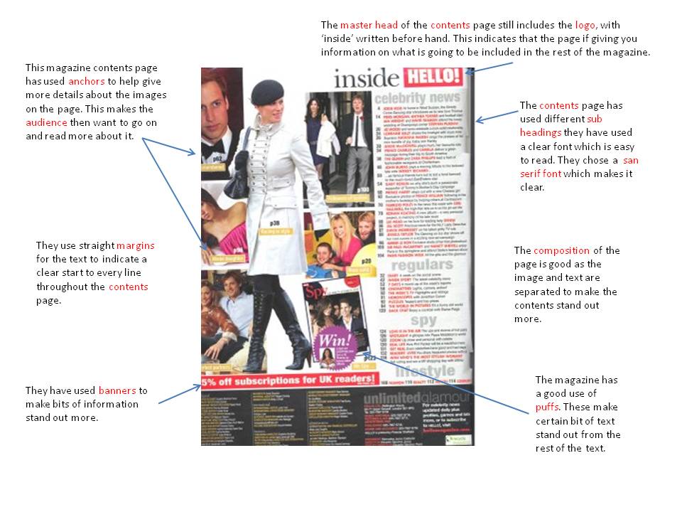
Here are my analysis of Contents Pages, I could not find any that where school based but here I have highlighted the main points of the Contents pages. The 'Hello' contents page has a target audience of female young adults, where as the bottom contents page is aimed as male young adults.

Wednesday, 7 November 2012

School Magazine Examples


 Here are my analysis of school magazine covers. They highlight the main features on the pages.The layouts of both magazine covers are very similar. The target audience for the FFH magazine cover is pre-16 and the  key genre is sports. whereas the School Sport magazine cover has a target audience of 16 to 19 year old attending school with the key genre sports.

The target audience for the FFH magazine cover is pre 16 and the  key genre is sports.


G321 Foundation Portfolio in Media

G321 Foundation Portfolio in Media: Preliminary Task School Magazine

Brief: to design and create the front cover and contents page for a school magazine aimed at pupils.